iPhone 14 Pro Review: One Of The Best Smartphones Money Can Buy
The iPhone 14 Pro’s 48 Megapixel camera, new dynamic island, always-on display and speedy chipset make it the best phone Apple has ever made.
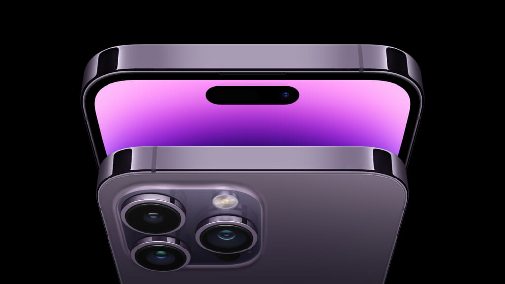
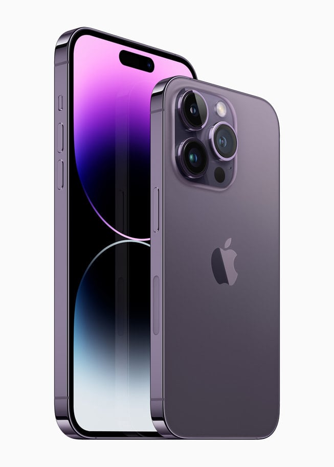
The iPhone 14 Pro is now in the public’s hands. Touting an always-on display, a “dynamic island” to replace the notch, a 48 megapixel camera and a host of upgrades thanks to iOS 16. After spending a week with Apple’s flagship phone, here’s the verdict on whether the 14 Pro is worth the upgrade.
The 6.1” Super Retina XDR display in the iPhone 14 Pro is now always-on, making notifications accessible at a glance at all times. This is a much more useful feature with iOS 16’s upgrades to equip lock screens with widgets, photos and other focus-centric elements that will change depending on timing or location, so whether Office Focus or Home Focus is enabled, the right notifications will come through and always be a look away—no annoying screen tapping necessary.
So far, always-on is hit and miss. I have a habit of laying my phone face down when I’m home because of the huge camera bump, so always-on is a moot point until I break myself of that habit. At work my phone sits in a charging dock on my desk and always-on has immediately proven useful, if only to circumvent the angry flick I used to give to my screen to see notifications.
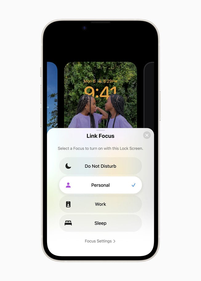
Because of iOS 16’s Focus levels, I have the 14 Pro set to automatically move to Office-Focus when I enter the geofence I set around my business. This level of customization, along with the ability to glance at notifications, has made always-on more useful than I anticipated. Though I don’t like the idea of having to adapt myself to the phone (it should be the other way around) I can’t help but think always-on will get even better as I slowly slide into new habits.
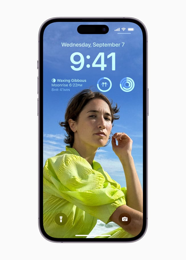
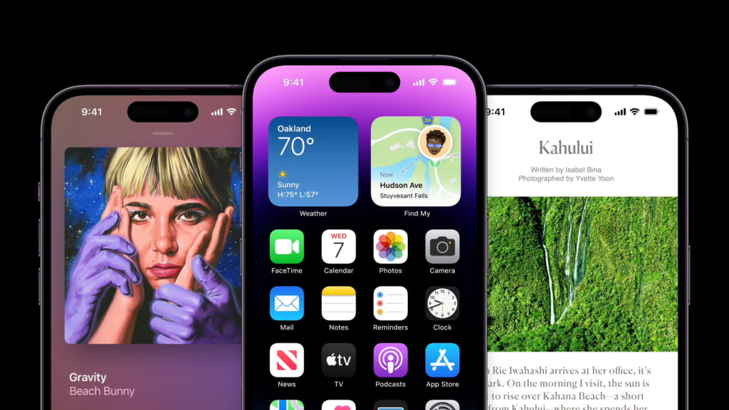
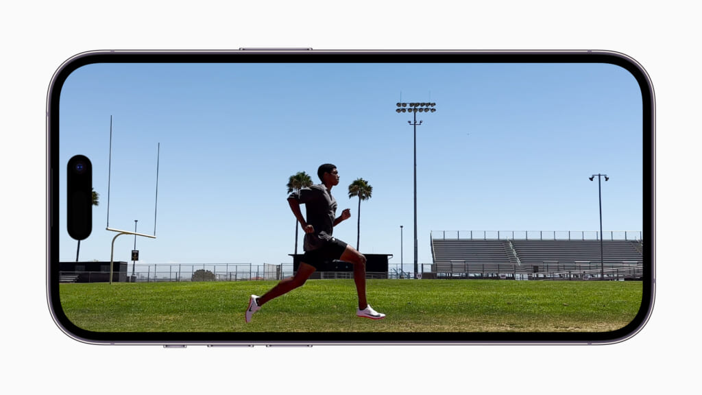
Easily the most noticeable change in the 14 Pro is the dynamic island. Previously, the notch at the top of the iPhone screen housed the front-facing camera and other sensors, flanked by details like the time, Wi-Fi signal and battery life. Now, the dynamic island sits further down, leaving a sliver of screen above it and dynamically grows and shrinks when notifications come in.
This is Apple’s way of taking the necessary blackout space of the notch and shifting it to something useful. When playing music or using maps, switching to a different app automatically puts the essentials into the dynamic island and makes them accessible with a tap or, in the instance of music, quick controls with a long-press.
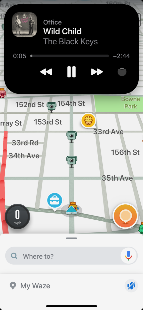
The dynamic island undoubtedly still has a long way to go before it’s fully realized, but those improvements are a certainty since Apple has opened the dynamic island API to app developers. For now, using the dynamic island to quickly control music or bring my phone back to Waze for navigation is helpful but not mind-blowing.
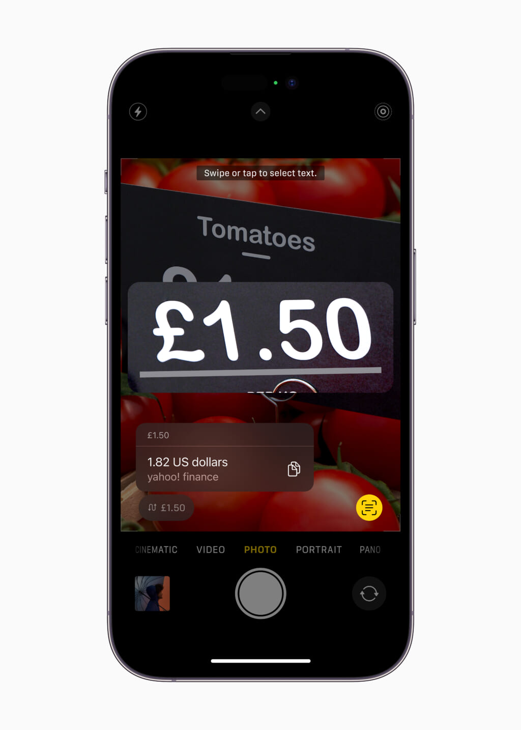
The potential is huge though. Having live scoreboards so I can follow the Yankees game or my fantasy football StatTracker could be a genuine game changer that makes even Apple’s own widgets pale in comparison. There’s definitely a reason an app on the Google Store that recreates the dynamic island on Android devices has already been downloaded over 1 million times. Compare this even nascent dynamic island to the utterly useless notch, and the 14 Pro has a clear leg up on its predecessors.
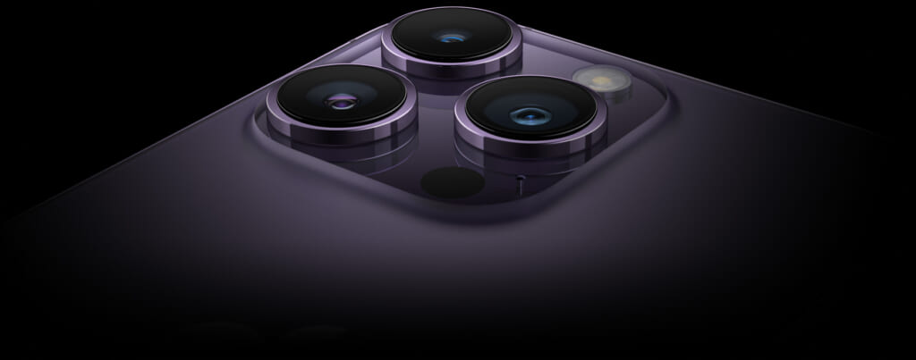
So much of what gets done on phones, from social media to augmented reality, leverages the camera array, so there’s no surprise when each iteration of the iPhone upgraded the cameras. The iPhone 14 has an impressive set of sensors that make 48 megapixel images, 4K video and optical image stabilization (OIS) possible. Apple’s synergy between their hardware and software boosts the camera’s capability to take better low-light pictures, spit out RAW format for post-production or stabilize action videos in an impressive way.

Last year’s 13 Pro camera was damn good. Responsive, clear and versatile, there was very little left to want from Apple’s mobile pro camera sensors so, in testing, I focused on what’s changed. It’s impressive to see how upgrades to low-light, 4K Cinematic video and image stabilization round out the already-excellent system. 4K Cinematic video makes for seriously impressive video sequences in the right circumstances (try it at a cocktail party or wedding reception for really great results) and the action button for OIS is a fun novelty.

It’s the low-light shooting that’s the most significant upgrade here. Low-light shots have always been the Achilles heel of phone cameras and Apple seems to have cracked it in the 14 Pro. Dark environments are suddenly not off limits for taking pics. That means clearer, better lit shots from last night at the bar—aren’t those really the pictures everyone wants most the next day?
Often Apple’s year-on-year upgrades to their phones feel insignificant, but the iPhone 14 Pro feels like a bigger bump than usual as Apple continues to refine their mobile hardware. The 14 Pro isn’t without flaws: USB-C is glaringly missing, the new deep purple color is bland compared to last year’s Sierra Blue that was more unique (and oddly no longer an option), and the dynamic island still has a lot of growing up to do. Those are minor gripes compared to how admirably the iPhone 14 Pro performs overall.
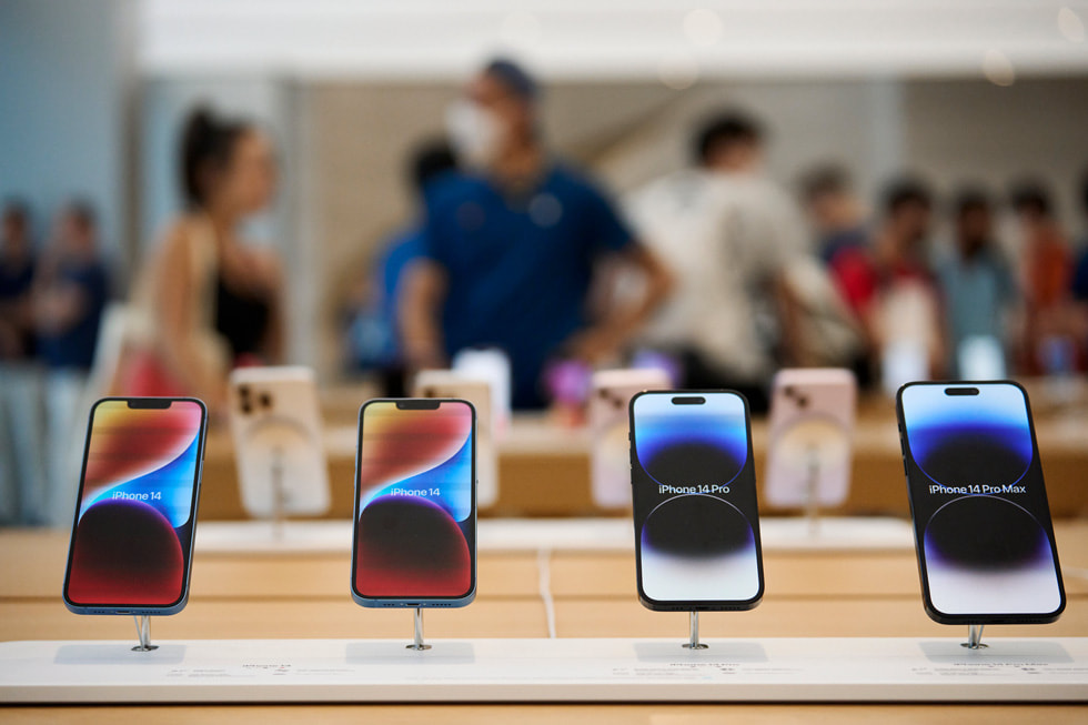
Apple is hyper-aware of its customer base, realizing that the average person no longer upgrades their phone annually but every three or four years instead. So there’s no surprise when going from a 13 Pro to a 14 Pro feels incrementally better but three years of those incremental upgrades feel significant to a person going from an 11 to a 14. Still, there will always be people who yearn for the clout of flexing the latest and greatest phone on the market. The iPhone 14 Pro absolutely fits that bill.
