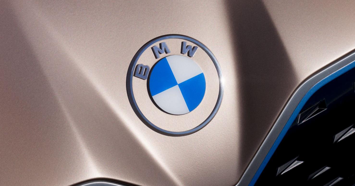
BMW just unveiled the first redesign of its instantly recognizable logo since 1997.
The new emblem made its debut on the Concept i4, the German marque’s first all-electric model in the premium midsize class. The roundel’s central quadrants are still blue and white, but they no longer have three-dimensional shading.
BMW took the opportunity to explain that the colors are a nod to the official flag of Bavaria—the German state in which the company is headquartered—and not a depiction of a rotating airplane propeller, which is reportedly a myth originally born of a 1929 ad that promoted a BMW-made aircraft engine.
Moving outward, the black filler surrounding the quadrants is now color-matched to the car—on the Concept i4, the section appears in Frozen Light Copper. The “BMW” font is white, lean and shade-less, as is the outer-most ring.
“The new communication logo radiates openness and clarity,” BMW executive Jens Thiemer said of the design. “With this new transparent variant, we want to invite our customers more than ever to become part of the BMW world. In addition, our new brand design is geared to the challenges and opportunities of digitization for brands.”
Naturally, these changes have spawned controversy. A writer for the Verge condemned the badge, saying that it “just looks plain bad” and exemplifies “everything that’s wrong with modern logo design.” Here’s how other Twitter users reacted:
https://twitter.com/vladsavov/status/1235490195492884482https://twitter.com/maloonds/status/1235355881325412353
Ugghhh! Love the cars, hate what they’ve let someone do to their logo: faint, flaccid, forgettable, pffffft! Looking forward to the next logo rethink sometime in Summer/Fall 2020. #bmwlogo pic.twitter.com/o8DZ70sfbQ
— Grant Johnson (@eye_signs) March 4, 2020
As for the EV on which the badge appears, it’ll have 530 horsepower, a 270-mile range and fastback lines. BMW is investing over $220 million in its Munich factory to bring the i4 out of the concept phase and into production by 2021.

